

MySBA Project
Overview
Ask
Design a citizen-facing portal to bring certifications, loans, and business resources all into an easy-to-use central hub.
The Problem
As a small business owner, accessing loans, certifications, and learning resources from the U.S. Small Business Administration can feel complicated. Currently, there are over 8 different tools available, but none offer a unified experience, leaving users to navigate multiple platforms to find what they need.
My Role & The Team
I held the User Experience Designer role before being promoted to Lead User Experience Designer. At the inception of the project, there was a Design Team Lead, a Design Strategy Consultant, and a User Researcher. These roles dropped off as the product matured and I assumed the Design Team Lead's responsibilities.
Outside the design team, I primarily collaborated with agency partners, four developers, the Chief Architect, and our QA Lead.
Constraints
UI had to use the US Web Design System, a visually limited design system from the US government. Since reducing development time was a high priority design was constrained to using this limited system.
It was up to other parties to make data available to us. This often left me with limited ability to build out features.
The Paperwork Reduction Act limits user research in government to only 9 participants.
Bureaucracy! It's government after all.
Tools
Figma, Figjam, Mural, Jira, Adobe Creative Suite, Github
Duration
Late 2023 - 2024
.png)
.png)

Let me tell you about one of our early user
research participants to explain...
The Problem
Meet Jane
Jane, a bakery owner and a mother of four, wants a certification and a loan with the Small Business Administration.


Jane looks for where to apply but finds four different portals. After searching through them she finds that the Woman-Owned Small Business Certification portal is called "WOSB" a confusing acronym she hasn't heard before.
Jane applies and enters a lot of information to get her Woman-Owned Business Certification. She then goes to apply for a loan.

Jane got lost navigating to a different portal to apply for a loan. She finds that the login isn't the same and not only does she have to make another account but she has to enter all her business information again.


Is this it??
No, that was spam...
I thought this was it?
I'm here?
Not yet?
Wait, I have to enter this all again??!
Am I at the right place?
6 months later she goes back to check on her loan and certification and becomes frustrated logging into multiple portals to access her information.

MySBA Project
Research
On this project, I was lucky to be paired with a full-time researcher while additionally being given access to previous agency research in our problem space.
All in all hundreds of pages of research documentation, thousands of data points, and dozens of participants across studies influenced the designs.
It's too much to show here, but I'll dive into the project I was most involved in:
usability testing.

Usability Testing
Informed by existing and new research I created initial designs that we tested directly with users.
Our nine participants came from around the country with a variety of backgrounds and specialties. All users were interviewed with a working prototype and were asked to complete a variety of tasks to assess the usability of the platform. They were also asked to express general sentiments in interacting with the product.

What we found
Users loved to see resources available to them but hated to see them as a side bar. They felt like it was too distracting.
Additionally, users didn't understand the need to have a loans or certifications page. They enjoyed seeing everything in one place on the dashboard and found extra pages to be repetitive.
What did I design to make user experiences better?
Single Sign On
Universal sign in across agency platforms

MySBA Home
Loans, certifications, and resources tailored to your business all in one place.
.png)
MySBA Apps
A central app launcher to quickly access all MySBA products.


MySBA Home


Centralizing Information
The overview page united data sources from across the agency. Here, users can see all of their loans, certifications, and businesses in one central place.
.png)


Illuminating Resources
User testing revealed that the most important resources for users were their local office and events. Leveraging available user data, I customized this page for each user based on their location with the ability to easily search other zip codes.

Answering FAQs
To give users easy access to help and reduce common call center issues a frequently asked questions section was provided with a callout to contact the SBA.

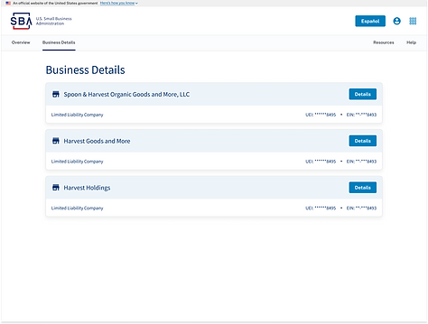

Business Details
Through user testing, I found that users often wanted to see their business information to cross-check.
MySBA
App Launcher


To unite the apps I created a universal app launcher that allows users to quickly navigate between certifications, loans, disaster assistance, learning, and home.
Single Sign On
Single sign-on unifies the login experience across the agency's family of applications. This allows users to more easily jump between their resources and find what they need.


MySBA Home

MySBA Loans


MySBA Certifications
What would I have changed
Reflection
Making technology in government is hard, and it comes with a host of its own challenges not seen or exasperated in comparison to private companies.
If I could envision the agency of the future it would look like this: a web app. Singular.
The government would ask what it needs to know about you to create an account and your resources would come to you.
-
You’re located in Seattle? Here’s your local office.
-
You just started your business? Here’s our resources for your new businesses.
-
You’re eligible for a certification you didn’t know about? Here’s more info and a prompt to begin the application process pre-filled with the information you’ve already entered.
This is the approach we took when we designed for MySBA. “How can we leverage what we know about the user and reduce the user burden wherever possible?”
Government should be simple, low touch, and personal. It shouldn’t be repetitive – asking you for information over and over again that it already knows. Resources available to you shouldn’t be impossible to find or even know about.
We should leverage what we know about citizens in centralized products and bring the resources to them.
Getting to this idea is a big dream, but over only a year I think we took a huge step toward this. The site still has far to go, and many ideas were left behind for feasibility's sake, but I hope the product can further expand functionality and get us to the future I imagine for government experience design.